My laptop is being repaired this week (hello mercury retrograde 💔) and writing on my iPad is as painful as you think, so I’ll keep this short and sweet.
I’m so grateful to have you in my life.
You give so much to others through your kindness, creativity, and generosity.
You lift up those around you and spread joy when things feel hard.
I often take so much for granted – my husband, health, friends, etc.
When I’m in a funk, this message is a great reminder that I still have a lot of things to be grateful for.
I’ve got this in a sticker form and have it on my laptop where I see it every day 🌈
It’s easy for me to feel I’m not _____ (pretty, talented, thin, productive, focused, loving, good wife – you name it, I got it.) enough especially when I compare myself to others (more on that next.)
It’s nice to see this reminder and tell myself that I’m enough the way I am today.
I use social media, like Facebook and Instagram, every day for my business. I love how easy it is to connect with my friends and community there.
At the same time, it’s made it so much easier to compare myself to other people on the internet.
These are the thoughts I have often:
“Woo, look at her beautiful studio space! My work space is a mess, and I can never show it to anybody.”
“Her shop has so many sales! I wonder if I’d ever be so successful.”
“Wow, she has so many followers and likes on Instagram. Why don’t I have more?”
I still have these thoughts, but this message grounds me.
I remind myself that there are lots of people who have fewer followers or “likes” (or not on social media at all!) and have a very successful business.
(Or HAPPY.)
And everyone’s journey is different. I’m the only person who can know 100% of what’s going on in my life and business. What works for someone else may totally be a wrong choice for me.
It helps me to find peace wherever I am in life.
And if you’re having similar struggles, I hope it helps you, too 😊
I didn’t have a goal of painting so many works in blue. But it’s one of my favorite colors because it’s soothing and calming. So I just kept painting in blues! (At the time of writing this article, I’ve painted in blue for 31 days straight. Wow!)
I like the challenge of using limited colors (and of course the limited timeline I set to complete a painting). Restrictions encourage creativity. The more limitations you set on your creative practice, the more creative you think!
Just think how you’d feel if you have a huge blank canvas with unlimited color palette and materials to play with, and you can paint whatever you wanted vs. someone tells you you need to draw a cat using just red and blue on a 4″x4″ piece of paper? See what I mean?
Of course, there is a danger of your practice becoming stagnant over time if you’re not intentional about working in a limited color palette.
When I feel my blue paintings are getting stale, I switch to different subject matters or add different elements. For example, I was painting still life at first, then abstract, and then more representational works.
One day, I did a lettering piece for one of my daily paintings and really enjoyed it, so I created a series of encouraging quotes in blue.
You know I love creating art with encouraging/motivational quotes! First of all, I do it because I need a positive reminder. And I know I’m not the only one who needs to hear it, so I like to share them 🙂
Art has the power to make you feel. When you see a powerful message represented in an art form, it goes directly to your heart, doesn’t it?
That’s how I feel about these paintings – somehow, these encouraging messages resonate with me on a deeper level than just hearing someone say it.
If you’re feeling blue today (pun so intended!), I hope these paintings will cheer you up! 🙂
Happy February! Hope you’re having a great start of the new year so far 🙂
This year, I’m continuing to focus on making products (greeting cards, art prints, and calendars), and I look forward to sharing more behind the scenes look and new releases with you 🙂
Since Valentine’s Day is just around the corner, I wanted to show you some of the love cards I’ve got in my shop today!
Ta da! Cute, yes??
I’m particularly happy with this “I Love You More Than” brush lettering card I created recently!
This design was born out of a doodle I made in my sketchbook one day. I was simply asking my fans on Instagram what they would say to their significant other if they were to tell them “I love you more than ____.”
I got a great response on that post and actually really liked the doodle lettering for it, so I turned it into a new greeting card design 🙂
(BTW, I gave it to my husband on our 10-year meeting anniversary a couple of weeks ago, and I said “I love you more than sweet potato fries!” :D)
When I design my greeting cards, I ask myself these two important questions:
1. Is this me?
I want to make sure my art reflects my style and voice – simple, whimsical, and has the childlike charm. Sometimes I draw something photorealistic (most likely by accident!) and it feels so unfitting to everything else I do, so I typically don’t share them even if they look good!
2. Does this have a happy vibe?
I want to make you happy with my art. Period. So I keep my imagery light and joyful. I might make dark and sad art as a personal exploration, but they don’t typically become my products.
Do you like my sweet love greeting cards? Explore your options in my shop today!
p.s. I ship pretty quickly (usually within 1-2 days), so you still got time before the Valentine’s Day 🙂
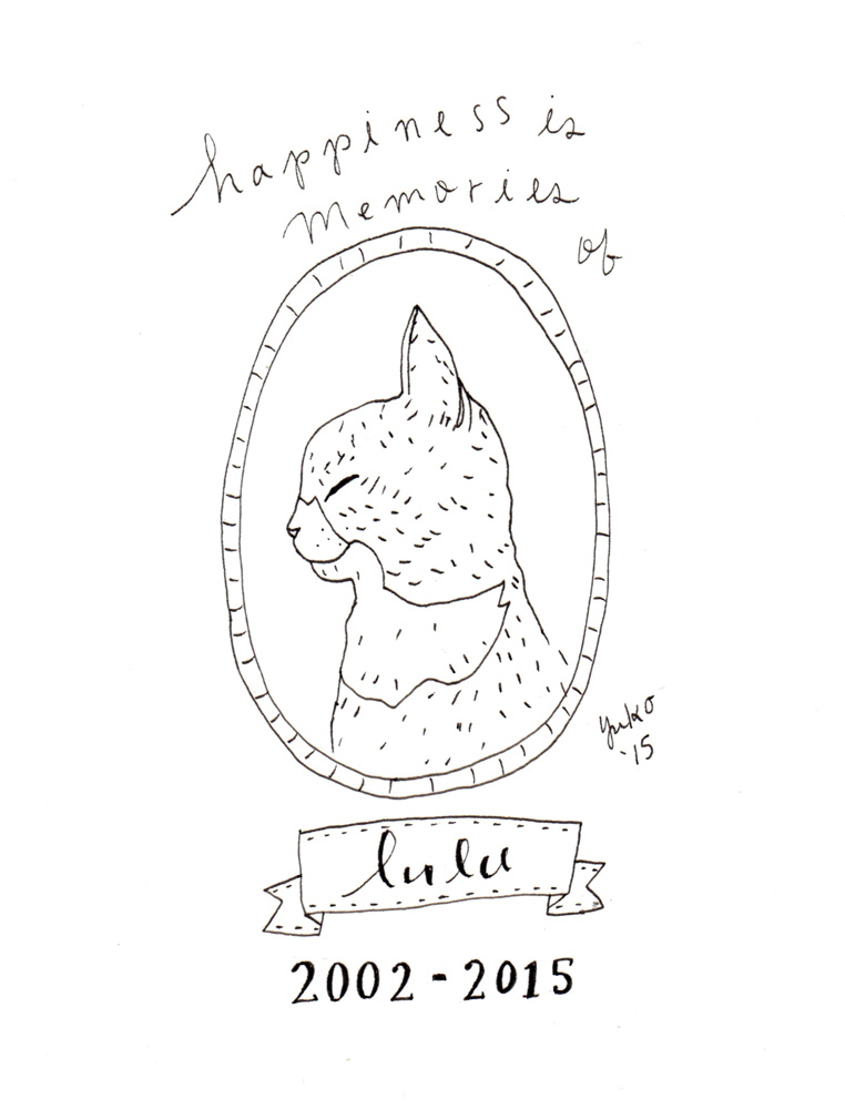
Since my parents wouldn’t let me have cats for a long time, I fantasized about having one pretty much 24/7.
My husband, Dave, always loved animals and was more of a dog person when we met. He was even allergic to cats growing up. But magically, he grew out of his cat allergy as he got older – it’s like he was destined to meet me, a hopeless cat-lover!
I had my two cats, Lulu and Sheppie, from my previous relationship, when we met.
Lulu (left) and Sheppie (right)
They were pretty much my babies. It was important to me that whoever I’d bring in to our life would understand how important they were to me and at least tolerate them, if not love them.
To my delight, my kitties won him over pretty quickly with their cuteness, loving personality (in their cat-like ways), and their comical antics.
Dave is so sweet and loving with any and all cats he meets. I sometimes wonder if he’s become a bigger cat person than I am now!
We’ve been through some scary and tough situations with our cats, too – especially, losing Lulu last year was extremely heartbreaking. He’s been my rock through thick and thin, and I’m really grateful to have him in my life.
Our sweet girl.
On Father’s Day, I like to thank him for being an awesome dad to my cats.
I’ve been making a cat Father’s Day card just for him in previous years because let’s face it, my cats are not very crafty 😀
And, I thought there might be other people who want to celebrate their cat dad, too!
So I decided to share this special Father’s Day card with you.
“Thank you for being an awesome dad to my cats.” Father’s Day card, 4.25″x5.5″ folded, blank inside.“Thank you for being an awesome dad to my cats.” Father’s Day card, 4.25″x5.5″ folded, blank inside.
Make your special (cat-obsessed) man smile this Father’s Day 🙂 You can order yours here.
p.s. I’m going to be closing my shop between June 1 – 12, 2016 so please place your order before May 30th in order for your card to be shipped by May 31st!
My new art collection, Eat a Rainbow, will launch exactly two weeks from today on Sunday May 1!
Woo hoo! I’m very excited 🙂
By the way, if you’ve missed the previous behind the scenes sneak previews, you can check them out here and here.
Today, I want to introduce you to my new notecards!
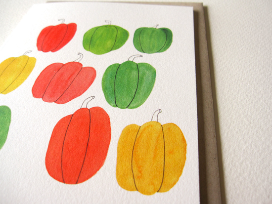
Eat a Rainbow, Bell Pepper, Summer Berry, and Tomato Notecards!
Just like my new art prints, the notecards come in 4 new designs: Eat a Rainbow, Pepper, Tomato, and Summer Berry.
These are going to be available as single card or as a set. I mean how could you choose, right?
I love pretty notecards. Whenever I’m at a craft show or visiting a cute gift shop on vacation, I pick up a few. They’re like a tiny gift of art that is also practical.
But I also admit that I have piles of pretty notecards I have accumulated over the years.
If you’re thinking – what do I do with more notecards? Fear not.
I’ve compiled 6 creative ways you can use these watercolor art notecards this summer!
1. Start a new tradition and send your handwritten season’s greetings to your friends and family during the summer.
Bell Pepper Notecard on 19pt Natural Savoy, 4.25″ x 5.5″
Do you send your family and friends greeting cards during the winter holidays? Well, it’s been almost 6 months, isn’t it?
How would they feel if they received an unexpected season’s greetings from you this summer?
I would think happy, delighted, and loved.
In Japan there is a custom to send a letter or a greeting card to friends and family during the summer months to wish them well – or more like “I hope you’re surviving the super hot and humid summer season OK.” If you ever lived or visited there in summer, you know how miserable it gets… 😀
I love traditions like that where it’s not related to any particular holidays. You simply reach out and say “I hope your summer is going well!”
Help them cool down with these refreshing watercolor art notecards!
2. It’s a perfect summer birthday card.
Each of the notecards feature my colorful and refreshing drawings of summer’s bounty and makes a perfect summer birthday card!
These cards are printed on a cotton savoy card stock and feel very soft and luxurious. It can totally be enjoyed as a framed mini-art after they read your thoughtful birthday message 🙂
Bonus if your birthday people are also into gardening, farmers’ markets, cooking, and, of course, eating good food ❤
3. Write a thank you note to your neighbor who brings you her homemade blueberry jam every summer.
Summer Berry Notecard on 19pt Natural Savoy, 4.25″ x 5.5 “
Are you one of the lucky people who have that special neighbor who loves to make jam with fresh, seasonal berries AND share them with you?? Homemade blueberry jam is my favorite, by the way!
Write a thank you note in my Summer Berry notecard and tell her how much you appreciate the delicious gift!
(Hint: she’ll probably bring you more goodies if you do :))
4. Your tomatoes are doing a little too well and you don’t know what to do with all of your bounty?? Invite your friends over for a tomato canning party!
Tomato Notecard on 19pt Natural Savoy, 4.25″ x 5.5″
I have a friend who plants lots and lots (I mean LOTS) of tomato plants every year, and she turns them into delicious tomato sauce and cans them.
If you’re a canner, you know it is a “process.” You need to clean, peel, chop, measure, season, and cook your veggies or fruits. You prepare your jars and lids and can them in boiling water in a hot kitchen.
I love canning but it can be quite time consuming and labor intensive.
It’d be a lot more fun if you have your friends over and enjoy the process while catching up on your summer happenings.
Make it a special event by sending them my Tomato notecard as a handwritten invitation!
5. Send your family an illustrated report of what’s growing in your garden.
Eat a Rainbow Notecard on 19pt Natural Savoy
If you live in a similar climate to Seattle and have a vegetable garden, you’re probably growing many things (if not all!) that are illustrated on my Eat a Rainbow notecard.
Perhaps your parents are retired in Hawaii, or your brother lives in New Zealand. These everyday veggies we take for granted may be quite interesting to those who are not familiar.
Show and tell what you’re growing in your garden this summer with your loved ones living far away.
6. Invite your friends to a garden potluck party!
Are you planning an outdoor potluck, wedding, birthday, anniversary, or retirement party this summer? Get your guests excited about the fun you’re about to have by sending an invite with these notecards!
The colorful and fresh vegetables and berries on these notecards scream garden party.
Send your invitations early before everyone’s calendar starts filling up this summer 🙂
Invitations have already gone out? (You, organized you!) You can send your guests these notecards as a thank you card later for making your party special.
How cute is this??
However you decide to use these notecards, you’re sure gonna make them (and you!) smile 🙂
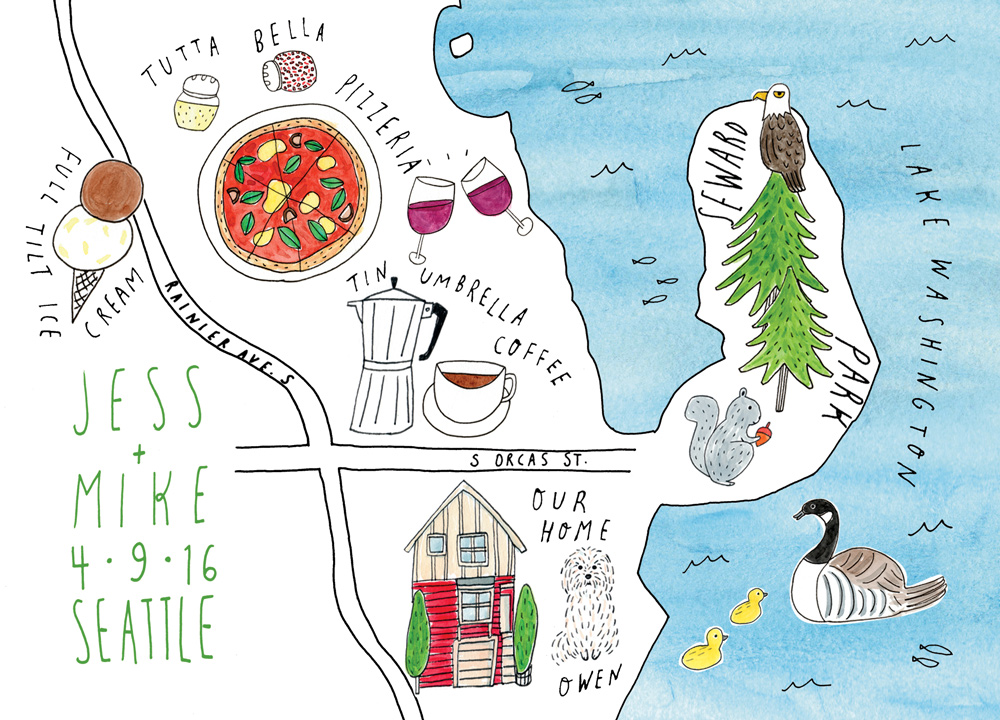
I recently worked on a map illustration for a couple for their wedding invitation. It was a really fun project, and I want to share my behind the scenes case study with you today!
Jess and Mike approached me last fall after seeing my work from one of my 365 Day Happiness Is art shows in Seattle. They said they liked my simple pen and ink drawings with watercolor and wanted something similar done for their wedding invitation.
1. Client Questionnaire
The first thing I do when I receive an inquiry for a commission work is to thank them for their interest and send them my client questionnaire to find out more specifics about the project.
My client questionnaire includes 17 questions to discover what the project goals are, what deliverables are expected, if there are any timelines, what would be a successful project, and what inspired them among other things.
I got many of the questions from Seanwes’ Value Based Pricing. They teach how to charge your client based on the value you create for them rather than charging flat fee for every project or asking for a budget up front. I was really inspired by this concept that lets you position yourself as an investment rather than an expense to your client.
I like having my potential client fill out the questionnaire first because it helps to clarify what the project is really worth for them. I find it especially helpful when a client says they want something quick and simple… because nothing is ever quick or simple!!
And even though many clients want to know how much the fee is up front, I can’t even begin to imagine how much it’s going to be without knowing what the goal is and what will take to achieve that goal.
2. Client Consultation
After I got their questionnaire back, I reviewed their information and believed I could help them with what they needed. So we met for a coffee to discuss further.
In our conversation, we went over their answers to the questionnaire more in depth and I was able to learn more about their personality and what they value. In a more personal project like this, it’s important that I get a picture of who they are because that’s essentially their “brand” and my final work will need to reflect that.
Both Jess and Mike are from out of state and have lived in lots of different places before they moved to Seattle and met a few years ago. They had recently moved to their new home in the neighborhood and love exploring what their new neighborhood has to offer.
Many of their wedding guests will be coming from out of town and have never been to Seattle before. They wanted the illustration to give their friends and family a glimpse into their new life together and get excited about visiting Seattle.
From our discussion, we decided it’s going to be an illustrated map of the neighborhood, including some of the landmarks that are meaningful to them.
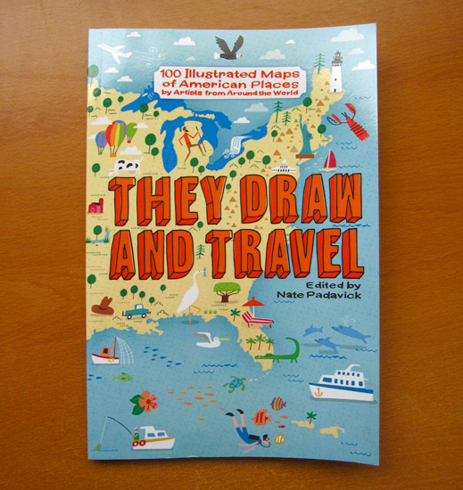
I’ve always liked illustrated maps. One of my favorite illustration websites, They Draw and Travel, had just released their book of illustrated maps so I got it for more inspiration and research.
Ah, the things I get for the name of research… 🙂
It was a perfect timing and the book is a treat for the eyes!!
3. Project Proposal, Contract & Payment
After our meeting, I put together a proposal (which also doubles as the contract) outlining my understanding of the objectives, timeline for everything, what deliverables they’re going to receive and how they’re going to receive them, and the fee estimate.
They agreed on the terms and paid the fee (I typically ask to be paid up front), so I put them on my project queue to work on.
The nice thing about requiring a payment up front is at least you know you don’t have to worry about getting paid afterwards! It really helps me focus on the project, and as a result, do a better job for my clients. It’s a win-win!
4. Research & Gather Reference Materials
I start my work by researching and gathering reference materials. I want to understand the subject as much as possible so I can translate their vision into a visual representation in a best way possible.
During my discovery process, it became apparent that my illustration needed to reflect their love for the neighborhood and how it’s a big part of their new life together. Since I also live in the neighborhood, I’m familiar with the landmarks and the feeling they’re referring to. But I’ve never really paid attention to the details of what’s there, so I took an afternoon to walk around and explore more.
For example, I went to their house and took some photos and got the feel for what’s around. I also visited the other landmarks they mentioned and looked around a bit and snapped some photos. I gathered some other reference photos online as well and read about what animals and trees grow around here.
5. Conceptualizing & Sketching
After I get my research done, I start sketching elements and concepts.
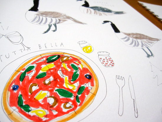
A loose pen and marker drawings of potential conceptsOne of their favorite restaurants in the hood. Mmmmm, pizza…I make several concept sketches in pencil.
When I get a good idea of what to include in the piece, I create a rough sketch with pencil on paper. Here, I drew a couple of boxes in the same size as their invitation so I knew exactly the size I was working with.
After I decide on the general concept, I trace several aspects of different versions of my rough sketch on to a tracing paper and create a little more polished version of my concept sketch.
The way I typically approach my client work is – and I always explain this to my client and get them on board before starting anything – is that I get all the information I need up front and then go away and do my work. I don’t create multiple options for them to choose from or do revisions based on arbitrary feedback. (You can learn more about the One Concept Approach here. )
I do however show my client the initial concept sketch just so they know which directions I’m headed. If they have any objective feedback, like hey, you misspelled a name or it is way outside of the vision for the project, then I’ll take that into consideration moving forward.
6.Drawing, Digitizing & Refining the Artwork
Once we agree that we’re on the right track, I’ll continue working on the piece, revising and refining it many times to ensure it is going to meet the project goal.
I create drawings of each of the elements separately in my Canson Mixed Media sketchbook. I usually start drawing with pen and ink directly with my Micron pen (used size 08 for this project) to create my whimsical and organic illustration style.
And then I colored them with watercolor and gouache (various brands). I wanted to make sure the overall feel of the piece fits my signature drawing style, so I paid attention not to overdo anything.
I drew a few versions of each elements (i.e. building, trees etc.) and chose the one that would work the best. I then cut them out of my sketchbook pages and taped them on to a sheet of paper and scanned them in.
I do this because my scanner is not very big, and it’s kind of a pain to scan the 9×12 page, and I can save time by scanning only pieces I needed.
Bits and pieces of my illustrated elements to be included in the map.
Once I scan the hand-drawn pieces, I bring them into Photoshop and edit them (e.g. enhance colors, clean up the messiness etc.) to get them ready to be added to the map.
To draw the outline of the map, I pulled up Google map of the neighborhood and sketched it a few times on paper to practice. Drawing maps can be tricky. Though I’m not trying to create a realistic map, it still needs to be somewhat recognizable as the map of the area.
I ended up using a grid drawing method (here is a quick tutorial about the method if you’re interested) to get the general shape and proportions accurately.
Here is the outline of the map created using the grid drawing method.
I traced the map with the pen on the tracing paper and scanned it to be digitally manipulated.
Once I have the outline of the map and the illustrated pieces scanned and edited, I began to put them together in Photoshop, referring to the concept sketch I made initially.
I also print out the artwork several times during this process to make sure it’s legible and readable in the format the artwork is going to be used. Although you can’t really guarantee how the colors will be rendered on their end, it’s a good idea to check how they turn out from your printer. It’s always little different than what you see on your monitor!
I print out the artwork several times during the process. I print it out in a larger size to look at the details and also in the smaller size (the size of the wedding invitation) to make sure everything still looks OK.
I keep revising and tweaking. It could be a pretty tedious process!
Once I’m happy with the general layout, I create the lettering pieces to fit in the space. Again, I make a few different options, decide which ones would work best, scan them in, edit them in Photoshop, and bring them in to the artwork.
With the lettering pieces in a general place, I do the layout, tweak it a little bit, look at it carefully, print it out if necessary and repeat the process until I feel good about it.
Getting close!
7. Preparing & Delivering the Final Files
Once you’re done with all the revisions, it’s time to submit the final files to your client! Hooray!
For this client, I created a high-resolution PDF file for print and a low-res jpeg file for web (in case they wanted to share the work online with friends and family) and sent them via Dropbox.
It’s always a little nerve-racking to wait to hear back from the client after you hit the “send” button. Even though I know my work is good and I did everything I could to meet the project expectations, I often get anxious wondering if they’d agree!
Jess and Mike wrote back a few days later to tell me how much they loved the artwork 🙂 They loved it so much that they asked me to create the lettering work that goes inside of their invitation. I love it when a client is so happy with my work that they give me more work immediately!
And here is the final artwork for their wedding invitation!
Here is the final illustration for their wedding invitation. Congratulations to the happy couple ❤
I hope you enjoyed the behind the scenes look into my illustrated map project! Jess and Mike were great to work with, and I had a lot of fun creating this custom piece for them.
I’ve been little obsessed with buckwheat breakfast porridge lately.
Buckwheat is awesome. It’s super nutritious (very rich in fiber and protein as well as Vitamin B-6, Iron, and Magnesium among other things), and is a good option for breakfast hot cereal if you’re on a gluten or grain-free diet. Despite its name, buckwheat is not a wheat or grain. It’s actually a seed!
I get toasted buckwheat groats in a bulk section of our natural grocery store. I love the nutty, earthy flavor so much ❤
I use unsweetened soy milk for extra protein, and you could substitute it with other non-dairy or dairy milk, of course.
Some chopped walnuts and cinnamon are also good for this recipe! Or add some nut butter…mmmm. I just enjoy the natural sweetness of the fruits in this recipe, but you can definitely add sweetener of your choice if you’d like. Possibilities are endless!
I make my hot cereal/porridge pretty mushy to make it more digestible, so if you want it less mushy, you probably want to adjust the cooking time. Also, pre-soaked groats will cook quicker, so be sure to check after a few minutes if you don’t want yours too soft.
I hope you enjoy this simple and hearty breakfast!