Our last assignment for the Illustration Communication class was to design logos for ourselves!
イラストコミュニケーションのクラスでの最後の課題は、自分のロゴのデザインです。
Since I already have my logo, I decided to design a logo for my husband Dave, a.k.a. the Daver.
自分のロゴはもうあるので、夫のデーブのロゴをデザインすることにしました!
He is a Permaculture designer/educator/author and currently runs a company called Terra Phoenix Design. I choose to do a branding and logo design for him as an individual because…why not?
Because this is for him as an individual rather than his company, I designed a logo that reflected his friendliness and approachability.
これは会社ではなく、個人のロゴなので、彼のフレンドリーな性格が伝わるようなデザインにしました!
Here are my three concepts! こちらが3つのデザインです!
The Portrait!The Name!The Acorn!
My favorite is definitely the portrait. He has such a cute smile 🙂 I modified the portrait and made his facebook profile picture! It is a lot warmer and shows his personality well, I think.
In my last post, I talked about how I created my brand and named my business Honeyberry Studios. In this post, I want to show you how I designed my logo!
As an illustrator, I thought it would be imperative to create an original image for the logo that showcased my style. People describe my stuff as “cute, warm, friendly,” and such. So my logo needed to have those qualities as well.
It’s kind of silly, but I knew my logo needed to have eyes. I hear that eyes are windows to your soul, and if I wanted it to have some kind of emotional impacts on people, it needed to have eyes!
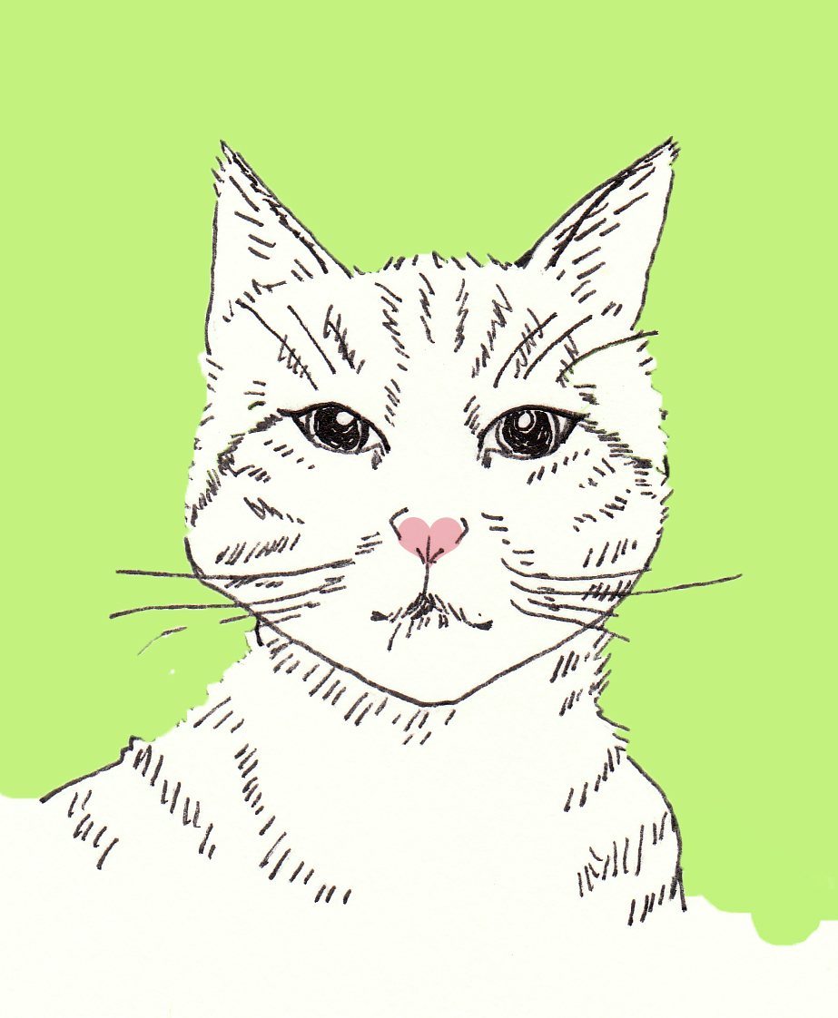
I also thought to myself: “If this is going to be a logo for my business, I better like looking at it all the time for a long time. What do I like to look at for a loooong time?” The answer was very simple. Cats. I love cats. I used to think of cats 24/7 when I was a child. OK, I still kind of do. I have two kitties, Lulu and Shepherd, and they have modeled for me a few times for my art. I was inspired!
I sketched some cat characters for the logo. It has to be simple enough so it looks good when the size is reduced. It also needs to work in color and in black & white.
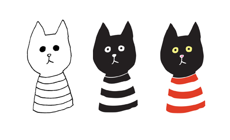
Luckily, I was taking a logo design class at that time, so I was able to get helpful feedback from the instructor and my fellow students about my design. This is my first version.
I combined my two lovely kitties, one black cat and one tabby cat with pink nose. After receiving feedback that “black cats have negative connotations,” and “the cat’s stare is too intense,” I made a few changes.
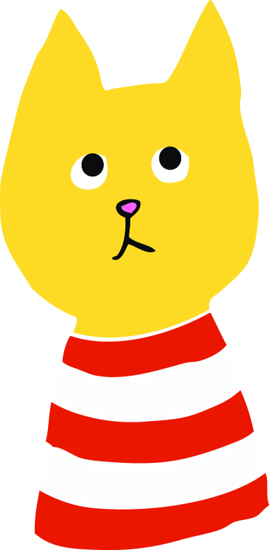
I made the cat honey colored, which actually works perfectly with the company name. Modification with the eyes were made, and it all of a sudden gave the cat some distinctive personality.
For the typeface, I looked for a script typeface that fit. I wanted a typeface that had a soft, handwritten feel to it. After searching for many hours on the inter web, I finally landed on a typeface called “Learning Curve.” I found it beautiful, simple and legible. Done!
I added a circle and dashed line inside of it to have a “stitching” effect to up the handmade feel of my company. For my class project, I incorporated the company name in to the logo, but in practice, I use them side by side. The warp of the text did not look good in the circle, and I would have needed to make the cat so small in order for the text to be big enough.