Our last assignment for the Illustration Communication class was to design logos for ourselves!
イラストコミュニケーションのクラスでの最後の課題は、自分のロゴのデザインです。
Since I already have my logo, I decided to design a logo for my husband Dave, a.k.a. the Daver.
自分のロゴはもうあるので、夫のデーブのロゴをデザインすることにしました!
He is a Permaculture designer/educator/author and currently runs a company called Terra Phoenix Design. I choose to do a branding and logo design for him as an individual because…why not?
Because this is for him as an individual rather than his company, I designed a logo that reflected his friendliness and approachability.
これは会社ではなく、個人のロゴなので、彼のフレンドリーな性格が伝わるようなデザインにしました!
Here are my three concepts! こちらが3つのデザインです!
The Portrait!The Name!The Acorn!
My favorite is definitely the portrait. He has such a cute smile 🙂 I modified the portrait and made his facebook profile picture! It is a lot warmer and shows his personality well, I think.
My assignment for the Illustration Communication class this week was to create an illustration for Bumbershoot event T-shirt! Bumbershoot is a festival of music and art that happens over the labor day weekend in Seattle. Their event posters are amazing, by the way.
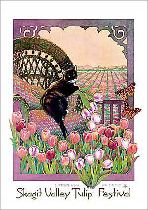
My favorite is this one with a kitty (of course) by Jerry Freiberg created in 2002.
For this assignment, I wanted the focus to be on the beauty of individual flowers, rather than the landscape. Not only do I LOVE flowers, I felt it would better showcase my line art style.
I had some ideas for composition for the poster, so I did a rough comp on Photoshop just to see…
まずはポスターの構図を見るために、フォトショップで大体の構成をチェック。
I actually liked the simple line drawings and one spot color for background, but for this assignment it made sense for the flowers to have more colors. When there is a bunch of black & white line drawings, it is hard to tell what’s going on especially if you’re not looking at it closely.
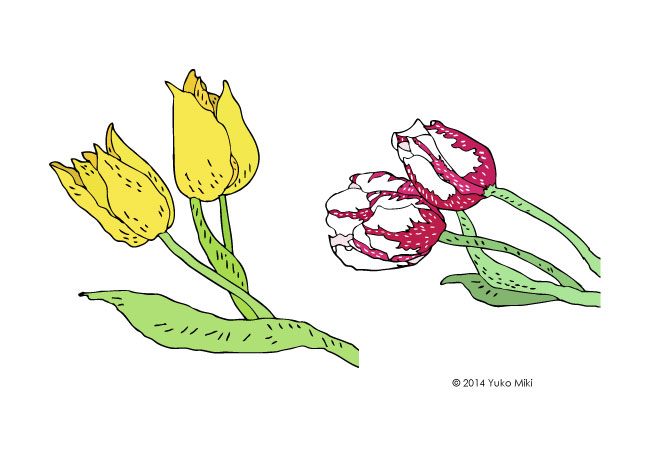
At first, I made tulips with green stems like real flowers. But then when I put a bunch of them together, it seemed too busy with the background color. And they just didn’t look very interesting to me…
Earlier in the design process even before I started drawing the tulips, I was thinking of designing a poster that looked kind of like a stained glass art. I also really enjoyed my black & white illustrations from the last assignment, so I decided to experiment…
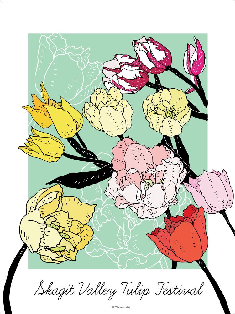
After hours of trying out different layouts and spacing, I landed on this final design.
何時間もかかってレイアウトを考えた挙句、このデザインになりました!
The poster!
Since the focus of our assignment was the illustration itself, I didn’t spend too much time with the typography. I chose “Learning Curve”, which is the typeface for my company, Honeyberry Studios’ logo 🙂 I think it fits the feminine and flowy style of this poster very well, though!
Extra credit – this is another version of the design. I decided not to go for it for the poster project, but I made a cover photo for my facebook page 🙂
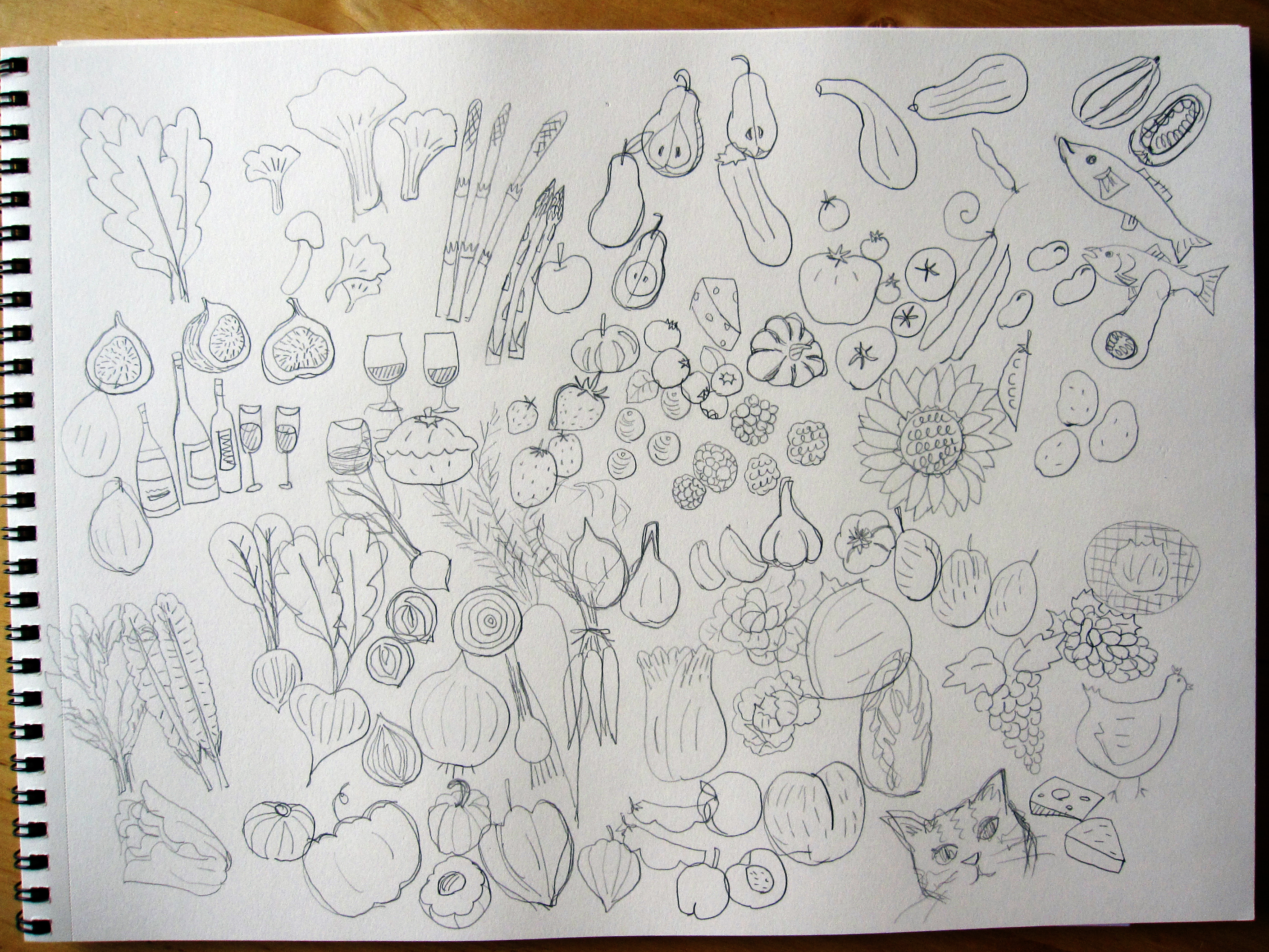
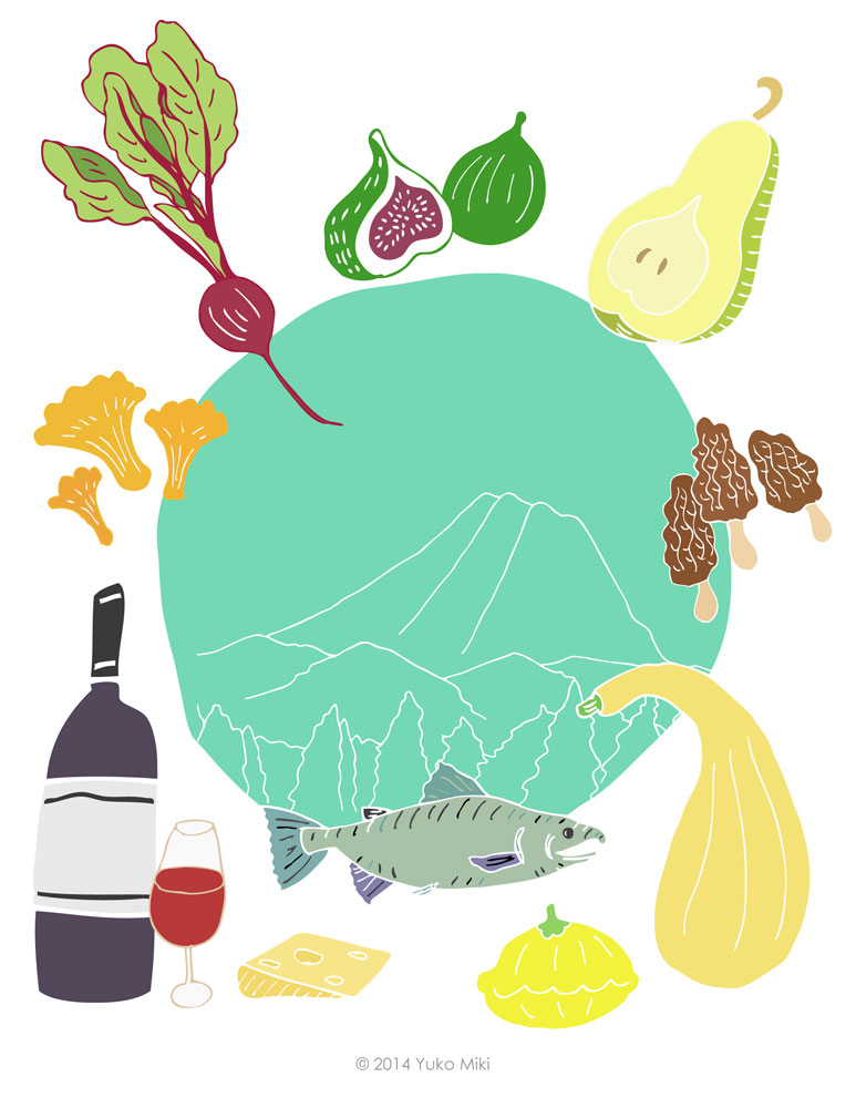
My first assignment for the Illustration Communication class was to create 12 black & white spot illustrations and one color illustration for a Northwest Food & Wine cookbook!
I chose to make 12 black & white illustrations of raw food ingredients for the spot. The assignment also required us to have images of wine bottles & glasses in some of our illustrations.
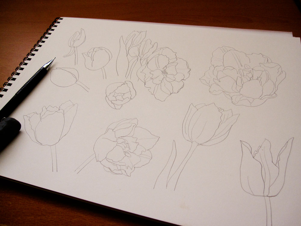
I usually start my process by making rough sketches with pencil on paper.
まずは鉛筆で色んなイメージをスケッチしていきます。
all kinds of Northwest food ingredients! (and a bonus kitty)
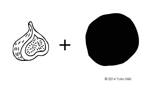
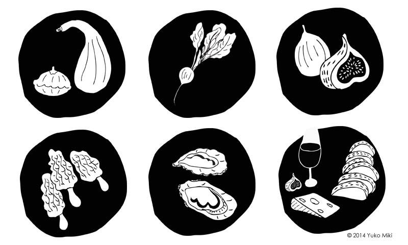
I then made pen & ink drawings to be scanned and processed in Adobe Illustrator. I decided to place each illustration in the black circle to frame item. It gives them consistent look and helps to make the line art stand out.
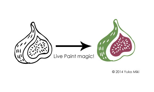
As for the color illustration for the book cover, I decided to use the colored version of the spot illustrations to create a consistency of the look. I also just really liked them 🙂 I used the live paint function in Adobe Illustrator to make colored illustrations for this project.
add beautiful colors to the black & white drawing!
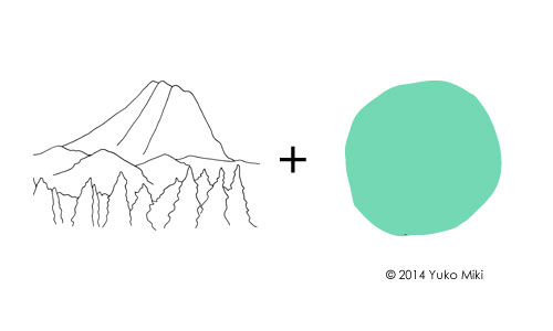
To tie it all together on the cover, I used the same circle shape as the spot illustration in the center. As a way to give a sense of location, I made a line drawing of Mt. Rainier to place in the circle.