Our assignment for the Illustration Communication class this week was to create a poster for the Skagit Valley Tulip Festival!
イラストレーション・コミュニケーションクラスの今週の課題は、ワシントン州で毎年行われるチューリップフェスティバルのポスターのデザインです!
Every year, they commission an artist to create a beautiful poster for the festival!
毎年、アーティストが選考で選ばれ、フェスティバル用のポスターをデザインします!
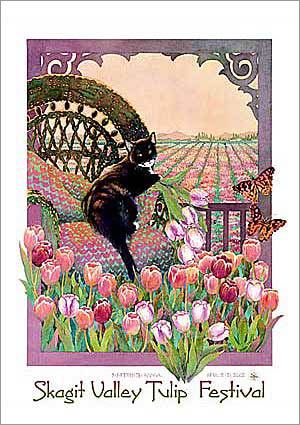
For this assignment, I wanted the focus to be on the beauty of individual flowers, rather than the landscape. Not only do I LOVE flowers, I felt it would better showcase my line art style.
この課題では、チューリップ畑の風景よりは、個々のチューリップに焦点を当てることにしました。花の絵を描くのは好きですし、その方が私の線画のスタイルにあっていると思いました!
I brought home different kinds of tulips from the local store and started sketching!
スケッチするために、色んな種類のチューリップの花束を買ってきました。

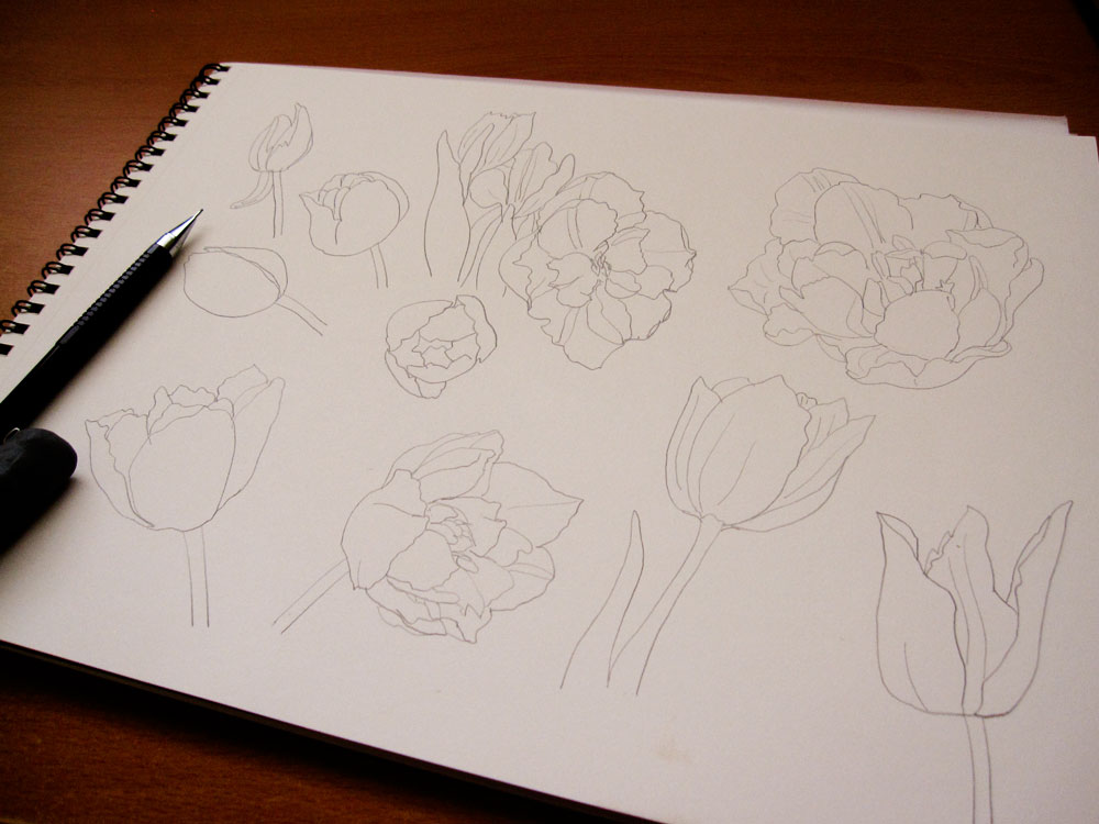
I then traced them on a vellum paper with a pen for easy scanning.
鉛筆でスケッチしたものをペンでトレーシングペーパーに移し変えます。そうするとスキャンしやすくなります。
 I had some ideas for composition for the poster, so I did a rough comp on Photoshop just to see…
まずはポスターの構図を見るために、フォトショップで大体の構成をチェック。

I actually liked the simple line drawings and one spot color for background, but for this assignment it made sense for the flowers to have more colors. When there is a bunch of black & white line drawings, it is hard to tell what’s going on especially if you’re not looking at it closely.
この白黒のバージョンも個人的には気に入ったのですが、チューリップフェスティバルのポスターということで、やっぱり色を足すことに。あまり白黒の線画が重なっていると、実際見づらくなってしまいます(特にポスターのように、ちょっと距離があるところから見る場合)。
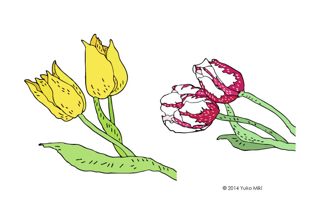
At first, I made tulips with green stems like real flowers. But then when I put a bunch of them together, it seemed too busy with the background color. And they just didn’t look very interesting to me…
始めは、茎や葉っぱを緑にしたのですが、どうも背景の色とマッチしません。複数の花を重ねるとまた分かりにくくなってしまいました。また、イマイチ面白みも足りないような。。
 Earlier in the design process even before I started drawing the tulips, I was thinking of designing a poster that looked kind of like a stained glass art. I also really enjoyed my black & white illustrations from the last assignment, so I decided to experiment…
チューリップを描き始めるまえにイメージとして浮かんでいたのが、ステンドグラスのようなデザイン。それから前回の課題で描いた白黒のイラストのスタイルも気に入っていたので、ちょっと実験してみることに。

I would say the experiment worked! I love how the colors of the petal pop out with the black stems and leaves.
実験の結果、この白黒と色の組み合わせがとっても気に入りました!茎と葉っぱの色を押さえることによって、花びらのカラフルさが際立ちます。
After hours of trying out different layouts and spacing, I landed on this final design.
何時間もかかってレイアウトを考えた挙句、このデザインになりました!
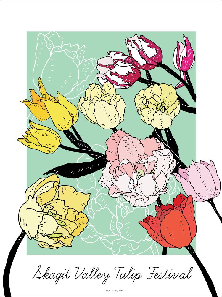
Since the focus of our assignment was the illustration itself, I didn’t spend too much time with the typography. I chose “Learning Curve”, which is the typeface for my company, Honeyberry Studios’ logo 🙂 I think it fits the feminine and flowy style of this poster very well, though!
この課題の焦点はイラストだったので、活字にはあまり気を使わなかったのですが、「ラーニングカーブ」という書体でとりあえずフェスティバルのタイトルを入れました。私のロゴにも使われている書体で、このポスターの柔らかい感じにフィットしていると思います!
Extra credit – this is another version of the design. I decided not to go for it for the poster project, but I made a cover photo for my facebook page 🙂
これはポスターの別バージョン。最終的にはこれにしなかったのですが、フェイスブックのカバー写真として使っています!

