Monthly Archives: January 2014

Birthday Floatin’

When I first heard of the sensory deprivation float a few years ago, I didn’t really get it.  You float in the water with no sound, light, or gravity…  It sounded kind of dark and scary.

数年前、初めて「アイソレーション・タンク」の存在を知ったときは、何がいいのかよく分かりませんでした。音も光も遮断し、タンクの中の水に浮かんで重力も感じない。なんだか暗くて怖いイメージでした。

Since then I’ve been trying different meditation and relaxation techniques to manage stress.  A couple of months ago, I came across a coupon for Urban Float in Seattle.  I decided to have my first float on my birthday!  As one of my friends put it, I was going to “spend my birthday in a fake womb.”

それからストレスを減らすために色んな瞑想や、リラクゼーションの方法を試してきました。数ヶ月前にたまたまシアトルにあるUrban Floatという、アイソレーション・タンクを営むサロンのクーポンを入手し、誕生日に自分へのご褒美として試すことにしました!ある友人には「誕生日を、ニセの胎内で過ごすんだね。」とコメントされてしまいました、、、

I made my appointment for the 50-mins float session.   When I checked in, the nice woman there gave me a quick tour of the room & the pod.  It was comforting to know that there is an emergency button inside of the pod…

1セッション50分で予約をしました。チェックインを済ませると、受付の優しいお姉さんが、施設の説明をしてくれます。タンクの中には緊急用のボタンもあるということで、ちょっぴりホッ。

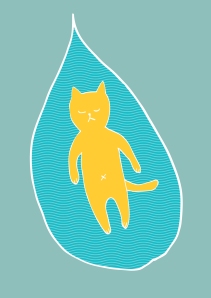
At this facility, you have an option of floating in a pod that looks kind of like a giant, sci-fi kidney bean (pictured below).  The water is kept at body temperature, and it is a highly saturated epsom salt and water, so your body floats even though the water is less than knee deep.  Once you’re in, you can close the top all the way, or leave it cracked, depending on your comfort level.  You wear ear plugs so the water won’t get in your ears.  This also helps shut out any noise while you float.

ここでは、SFに出てくるような近未来巨大インゲン豆のようなポッドに入るようになっています(下図をご覧あれ)。入っている水は人肌の温度に保たれていて、かなり濃い塩水になっています。なので、ヒザぐらいの深さなのに体がプカプカ浮きます!いったん中に入ると、屋根の部分を自分で閉めます。完全に閉じてしまってもいいし、不安な人はちょっと開けておいてもOK。耳の中に水が入らないようにと、渡された耳栓もします。これは外の音を遮断するためにもグッドです。

pod
space-age pod for floatation

After showering, I wasted no time getting my floatin’ on.  I got in the pod, closed the top all the way and lied down in the water.  It was a strange feeling to just “float.”  Normally, when I’m in the pool or the ocean, I’m trying to swim or move about in the water.  But here, you just lie still.

先にシャワーをしていざポッドに入ります!フタを全部閉めてから、水の中に横たわります。水の中でただ「浮かぶ」という行為にあまりなれていないので、ちょっとヘンな気分。

honeyberry_floatinglg

It took me a few minutes to relax my head.  I’m so used to laying on something solid, something to support my head, so letting my neck to relax in the water was hard.  I was afraid my face is going to be under the water.

頭をただ横たえるというのにも少し時間がかかりました。いつもは何か中身がある(?)ものに頭を横たえるのに慣れているので、水に浮かべるというのはちょっとドキドキしました。力を抜くと、顔まで水の中に沈みそうになってしまって!

I was eventually able to let the water support my head, and my eyes, nose and mouth stayed above water.  They play a soothing music for the first and last 5 minutes of your session.

それでも段々力を抜いて、頭もプカプカ浮かびます。ちょっと沈んでも、目、鼻、口はかろうじて水面上です!セッションの始めと終わりの5分間はリラックスできる音楽が流れます。

I tried not to move my body once I got the hang of floating.  For some reason I was drifting inside of the pod.Eventually, I stopped drifting.  But whenever I focused on not moving my legs or arms, it started twitching!  Because you don’t have other sensations, I became very sensitive to every little move I made in the water.  I felt the water around me rippling with the subtlest of moves.

いったん体を浮かべるのに慣れると、体は出来るだけ動かさないのが◎。浮かんだ初めは何故が体がポッドの中で流れ動いてしまいました。それも何分かすると止まりました。「手足を動かすまい」と思えば思うほど、ピクっと無条件で体が動いてしまったり。他に感覚があまり無いので、少しの動きにもとても敏感になってしまいます。ほんのちょっとの動きでも水に波紋が立ってしまうのが感じられます。

I thought I read on their website that the light inside of the pod would automatically turn off with the music, so I just floated there for several minutes.  I opened my eyes to see if the light had turned off, but it was on…  Actually, it stayed on for the entire time.  I could’ve turned it off manually, but at that point, I didn’t feel like getting up to push the button, so I let it go.  I could also hear sounds from outside as the facility is right by a busy street.

確かこのサロンのウェブサイトには、音楽とポッド内の明かりは自動的に消えると書いてあったと思ったんだけど、何分か経ってからちらっと目を開けると、まだ明かりが点いてる。それはいつまでたっても消えないで、結局セッション中はずっと点いたまんまでした。自分でボタン押して消す事も出来たみたいだけど、その時点で起き上がって消すのも何だったので、そのままにしときました。ちなみに、外は結構大きな通りで交通の雑音とかも何気に聞こえてきました~。

I went in and out of sleep while floating.  Had mini dreams.  Then the music came on to let me know that my time was ending.  It went by too quickly!

そうこうしているうちに、うとうとと眠気が。ちょこちょこ夢も見ました。そうしてあっという間にセッションの終わりを告げる音楽が流れ始めました。早い!

I got out of the pod, showered, and got dressed.  I felt super relaxed and a little groggy afterwards.  I drank lots of water and cooled off before heading out to the busy outside world!

起き上がってシャワーをして、着替え。後はとーってもリラックスし、ちょっと頭がボーっとしました。お水を一杯飲んで、体も冷ましていざ外界へGo!

My very first floating experience didn’t exactly knock my socks off, but it really helped me feel relaxed and detoxed.  I would be very curious to see how I would feel if I had an actual “sensory deprivation” experience, you know, without any light or sounds.  I’m sure it affects different people differently.  If you ever wonder what it’s like, try it and see how you feel!

生まれて初めてのアイソレーション・タンク体験は、思ったほど目からウロコ!とは感じませんでしたが、すごくリラックスできたし、デトックスもばっちりできました。本当に音とか明かりが遮断できていたら、きっと違う経験になっていたでしょうね。こういうのは個人差もあると思うので、興味のある人は是非一度お試しあれ。

Meet Honeyberry!

In my last post, I talked about how I created my brand and named my business Honeyberry Studios.  In this post, I want to show you how I designed my logo!

先日のブログでは、Honeyberry Studiosの名前の由来についてお話しました。今回は、ロゴのデザインの過程をお見せしまーす。

As an illustrator, I thought it would be imperative to create an original image for the logo that showcased my style.  People describe my stuff as “cute, warm, friendly,” and such.  So my logo needed to have those qualities as well.

イラストレーターというからには、やっぱりロゴは自分のイラストでしょう!と、まずは決断。私の作品を見た方からは、「かわいい」「あたたかい」「親しみやすい」などの感想をいただいているので、ロゴもそういう雰囲気があるものに。

It’s kind of silly, but I knew my logo needed to have eyes.  I hear that eyes are windows to your soul, and if I wanted it to have some kind of emotional impacts on people, it needed to have eyes!

ちょっとおかしな話なのですが、私は「このロゴには目をつけよう!」と決めていました。「目は魂に通じる窓」という言い方もあって、このロゴを見た人に何らかの感情を持ってもらうためには、やっぱり目が無いとねーと思い立ったわけです。

I also thought to myself: “If this is going to be a logo for my business, I better like looking at it all the time for a long time.  What do I like to look at for a loooong time?”  The answer was very simple.  Cats.  I love cats.  I used to think of cats 24/7 when I was a child.  OK, I still kind of do.  I have two kitties, Lulu and Shepherd, and they have modeled for me a few times for my art.  I was inspired!

それから、やっぱり自分の会社のロゴなんだから、自分が気に入ったもの、毎日ずーーっと見ていても飽きない物がいいなあ。と思い、それって何?と考えたところ、「ネコだ!」と結構簡単に行き着きました(笑)小さい頃はネコが欲しくて欲しくて、四六時中ネコのことを考えていました。(今もそういう所ありますけどね)。家で今飼っている2匹のネコたち、ルルとシェパードには以前に私の絵のモデルになってもらったことあるし、これはいいかも!

kitty in the window yellow lulu_color sheppie

I sketched some cat characters for the logo.  It has to be simple enough so it looks good when the size is reduced.  It also needs to work in color and in black & white.

それで、いくつかネコのキャラのスケッチ。これはサイズが小さくなっても何か分かるようにシンプルじゃないといけないし、白黒とカラーのどっちでもちゃんと見えないといけないんです。

Luckily, I was taking a logo design class at that time, so I was able to get helpful feedback from the instructor and my fellow students about my design.  This is my first version.

ラッキーな事に、その当時はロゴデザインのクラスを取っていて、先生や他の生徒さんからいろんな感想をもらえました。これが最初のバージョン。

initial comparison
raw sketch, black & white, color

I combined my two lovely kitties, one black cat and one tabby cat with pink nose.  After receiving feedback that “black cats have negative connotations,” and “the cat’s stare is too intense,” I made a few changes.

この子は、私の黒猫の子と、ピンクの鼻の子を組み合わせて作ったキャラ。でもクラスでは、「黒猫は不吉な意味もあるんだよねー」とか、「なんか目が怖い」という感想が出たため、そこを変えることに。

I made the cat honey colored, which actually works perfectly with the company name.  Modification with the eyes were made, and it all of a sudden gave the cat some distinctive personality.

そこで、ネコの色を黄色っぽくしてみたら、いい感じに。会社の名前にもマッチ!目の感じも変えたら、この子の性格がもっとよく見えてきました。

Yellow Cat Logo

For the typeface, I looked for a script typeface that fit.  I wanted a typeface that had a soft, handwritten feel to it.  After searching for many hours on the inter web, I finally landed on a typeface called “Learning Curve.”  I found it beautiful, simple and legible.  Done!

次はロゴの活字書体選びです。筆記体で、手描きっぽい書体を何時間もかけて探したあげくに、「Learning Curve」という活字書体を見つけました。綺麗だし、シンプルで読みやすい!決まり!

logotext

I added a circle and dashed line inside of it to have a “stitching” effect to up the handmade feel of my company.  For my class project, I incorporated the company name in to the logo, but in practice, I use them side by side.  The warp of the text did not look good in the circle, and I would have needed to make the cat so small in order for the text to be big enough.

周りを円で囲み、その内側に点線を加える事で、さらに会社の手作りさをプラス。クラスのプロジェクトでは、活字もロゴの中に入れたのですが、結局実際は横に並べて使っています。丸の中に入れてしまうと、どうも活字のゆがみ方が気になるし、活字を大きくしようとすると、ネコがすごく小さくなってしまう。

Yellow Cat FinalColor&BW

My color combo is determined based on what each color says: honey yellow=”honeyberry,” red = “warm and comfortable,” green=”nature.”

色の組み合わせは、その色の雰囲気で。黄色は「ハニーベリー」のハニーっぽさ、赤は暖かさと親しみやすさ。緑は自然っぽさという感じ。

I love how my logo turned out!

お気に入りのロゴが完成しました!

honeyberrybanner2

What’s in a name?

I’m super excited about my new creative company, Honeyberry Studios!  As you can imagine, a lot of thoughts and energy go into building a brand that represents you and your company.  Today, I want to tell you my thought process behind naming my company 🙂

私が新しく始めたアートとデザイン会社「ハニーベリー・スタジオ」。とってもわくわくしています。会社を始めると一口に言っても、色々考える事がたくさんあります。自分と会社のイメージとなるブランド作りはとても大切なステップです。今日は、どうやってこの名前に行き着いたかをお話しまーす。

I started an Etsy shop called, TeAmi Works, (te-a-me) back in 2010.  I started out by selling my hand-crocheted fingerless gloves.  I wasn’t sure where I would go with it, but I very much enjoyed my experience as a seller and the sense of community I had in the Etsy world, so I kept adding more crochet items.

私は2010年に趣味が高じて、かぎ編みの小物を売る「てあみワークス」というお店をEtsyという、オンラインのマーケットで始めました。初めはどうなることか分かりませんでしたが、お客様との交流や、Etsyというクリエイティブなコミュニティーの一部となれることが楽しくて、品物も増やしていきました。

Before you knew it, I started selling my illustration prints there as well.  I started doing more commission drawing work and loved it, too.  Then I began to feel a little funny calling my shop “TeAmi” because it means “hand-knit” or “hand-crocheted” in Japanese (my native language).  I did more than crochet then, and I wanted to do more.  I needed a new name and identity for my shop!

そのうちに、イラストも出品するようになりました。お客様に頼まれてカスタムオーダーで絵を描く事も増えていきました。そうなると、どうも「てあみ」という名前がしっくりと来なくなっていきました。かぎ編みだけでは無くって、色んな事がしたい!ということで、新しい名前とアイデンティティが必要になりました。

I started thinking of a new name that was as versatile as my crafts.  I thought of just using my name, Yuko Miki, but I mostly work in US, and as simple as my name is (to me), people mess up my name all the time.  So that was a no-go.  Then I thought of using an English word or words that reflected my Japanese-ness, like “persimmon studios” or “chestnut designs” or something like that.  Well, those are very popular, and there are hundreds of companies who use them already.

さて、どんな名前がいいでしょう?アーティストっぽく自分の名前だけ、というのも考えましたが、ここはアメリカ。私みたいな簡単な名前でもよく間違われるのですよ。ということで、それは却下。やっぱり、日本人っぽさをアピールするために、「パシモン(柿)」とか、「チェストナット(栗)」とかを使った名前を考えてはみたものの、それはやっぱり人気があって、他に使ってる会社がすでにいっぱい。

I literally went over hundreds of words that I thought represented my style and vision.  It needed to be simple, warm, and friendly, like my art.  It also needed to have an organic and natural feeling to it – as I get my inspiration from nature and organic things most of the time.

自分が作る物や、会社のイメージに合いそうな単語をいくつも書き並べてみる。これはシンプルで、かつ温かみがあって、親しみやすい物じゃないとダメ。自然っぽくて有機的な感じがするっていうのも大事なポイントの一つ。

I really liked the word “honey” for some reason.  It’s sweet and golden, and it’s good for you!  I started jotting down words that worked well with “honey.”  Then I thought of “honeyberry.”  Many people don’t know that honeyberry is an actual berry.  It is also known as “blue honeysuckle.”  They look kind of like blueberries with oblong delicious edible berries!  Being married to a permaculture designer, I get perks of learning about unusual edible things!  And even if you don’t know what “honeyberry” is, you still get the warm and sweet feelings from it, right?  Yes!  I knew immediately that was going to be the one.

書き並べた単語の中で、なぜか「ハニー」という言葉が引っかかる。甘くて、黄金色。しかも健康にもいい!そこで、「ハニー」と合うような単語もいくつか考えてみる。その挙句に、「ハニーベリー」という言葉が浮かんだ。知らない人が多いんだけど、「ハニーベリー」っていうのは本当にある果物。ブルーベリーに似た感じで、細長くて美味しいベリーなんですよ~。夫がパーマカルチャー関係の仕事をしているから、あまり世間には知られていない、おいしい物の情報が良く入ってくるのですよ。「ハニーベリー」が何かを知らなくっても、甘いような、あったかい気持ちになりませんか?思いついた瞬間に、「これだ!」と直感しました。

After trying out different combinations, I landed on “Honeyberry Studios.”  That encompassed my crafts, arts, graphic design, and who knows what else I’m going to be doing?  Perfect.  My research on the inter-web showed no one else had that domain name, so I claimed it right away.  Honeyberry Studios was born.

色々考えた末に、「ハニーベリー・スタジオ」という名前に決定。そうすれば、手作り小物でも、絵でも、グラフィックデザインでも、他にいろいろやりたい事が全部収まるかな?というわけです。調べた結果、まだウェブのドメインがあったので、即購入!そうやって「ハニーベリー・スタジオ」は生まれました。

I will show you how my “spokescat” Honeyberry was born in my next post 🙂

次回のブログでは、マスコットネコのハニーベリーが生まれるまでのいきさつについてお話しまーす。

space needle b-day card_watercolor

Welcome to Honeyberry Diary!

I just started a creative business called Honeyberry Studios where I make fun and adorable illustrations, crafts & design.  Honeyberry Diary is a blog about my creative adventures, inspirations, and simple joys of everyday life.

最近”ハニーベリー・スタジオ”というイラストや手作りクラフト、デザインのお店を始めました!このブログ、”ハニーベリー・ダイアリー”では、私が今挑戦していることや、インスピレーションを受けたこと、日々の生活で見つけたささやかな幸せな出来事などをアップして行きまーす。Image