My first assignment for the Illustration Communication class was to create 12 black & white spot illustrations and one color illustration for a Northwest Food & Wine cookbook!
私が今取っているイラスト・コミュニケーションのクラスでの最初の課題は、アメリカ北西部にちなんだ料理とワインのクックブックのイラストのデザインでした!白黒のイラストを12点と、表紙のカラーのイラストを1点。
I chose to make 12 black & white illustrations of raw food ingredients for the spot. The assignment also required us to have images of wine bottles & glasses in some of our illustrations.
白黒のイラストは、食材をモチーフにすることにしました。この課題ではワインボトルとグラスのイメージを用いる事も必須です。
I usually start my process by making rough sketches with pencil on paper.
まずは鉛筆で色んなイメージをスケッチしていきます。
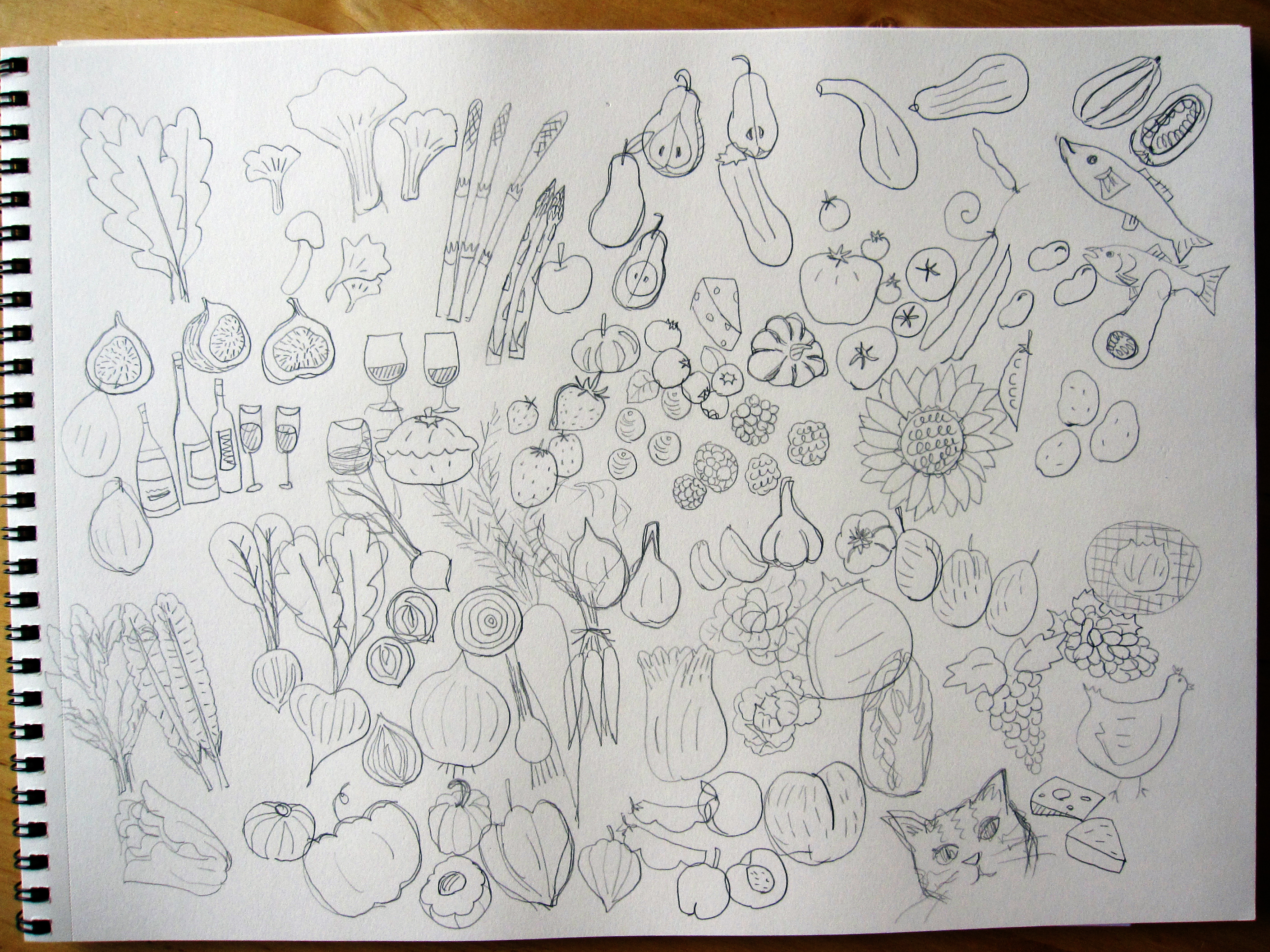
all kinds of Northwest food ingredients! (and a bonus kitty)
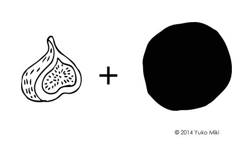
I then made pen & ink drawings to be scanned and processed in Adobe Illustrator. I decided to place each illustration in the black circle to frame item. It gives them consistent look and helps to make the line art stand out.
スケッチした物の中から選んだイメージをペンで描いていきます。線画をスキャンして、Adobeのイラストレーターを使って加工します。白黒のイラストは周りを黒い丸で囲う事にしました。それで12点のイラストに統一感が生まれ、白黒の線も際立ちます。
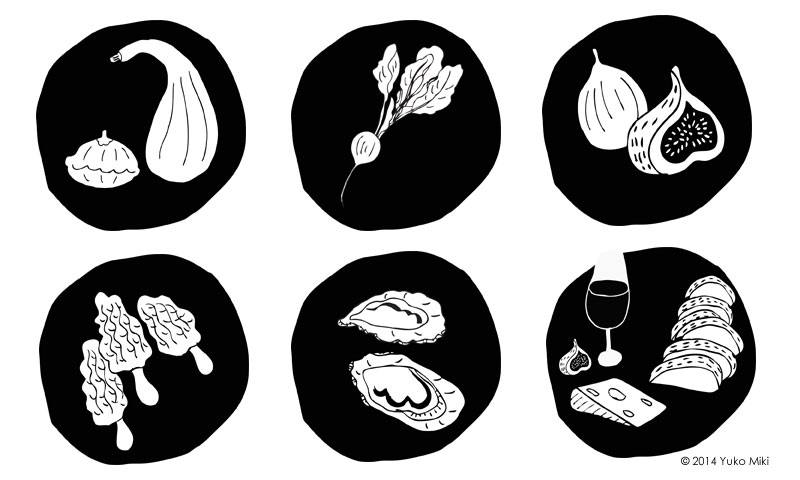
And, here are some examples!
これが白黒イラストの一例です!
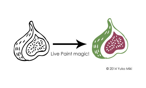
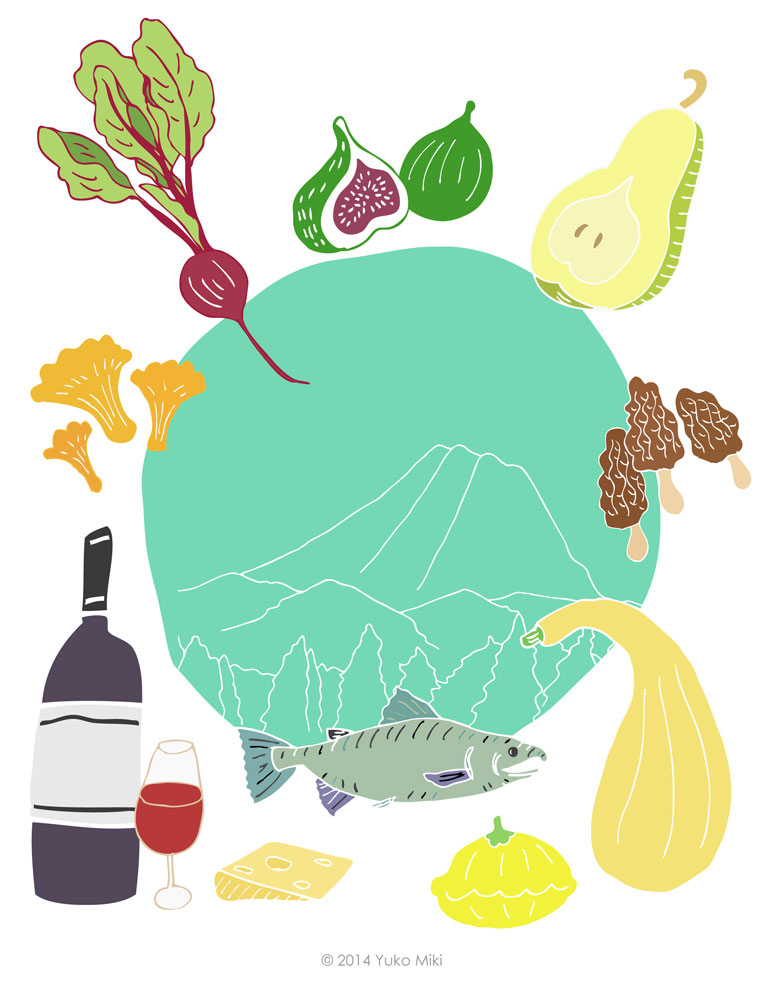
As for the color illustration for the book cover, I decided to use the colored version of the spot illustrations to create a consistency of the look. I also just really liked them 🙂 I used the live paint function in Adobe Illustrator to make colored illustrations for this project.
表紙のカラーのイラストは、また統一感を保つために白黒イラストで使ったモチーフを色づけして使うことにしました。このモチーフはとても気に入っているので、一度だけ使うのは勿体ないですよね♪
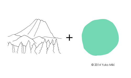
To tie it all together on the cover, I used the same circle shape as the spot illustration in the center. As a way to give a sense of location, I made a line drawing of Mt. Rainier to place in the circle.
表紙のイラストでは、白黒イラストで使った丸をターコイズ色にして、ページの中心に持って来ました。アメリカ北西部という位置づけを示すために、レーニア山の線画を加える事にしました。
And voilà! Here is the full-color illustration of the NW Food & Wine Cookbook!
そして、クックブックの表紙が完成しました!
I love good food, and I enjoyed this project very much!
おいしい物を食べるのが大好きなので、この課題はとっても楽しかったです!
