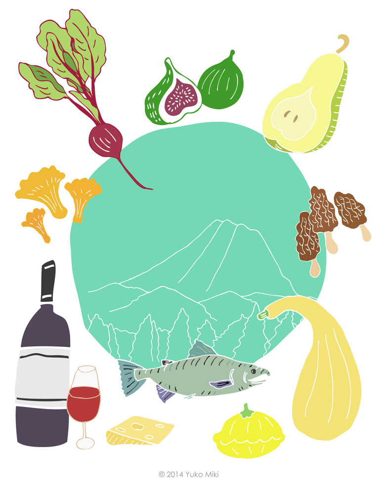
My first assignment for the Illustration Communication class was to create 12 black & white spot illustrations and one color illustration for a Northwest Food & Wine cookbook!
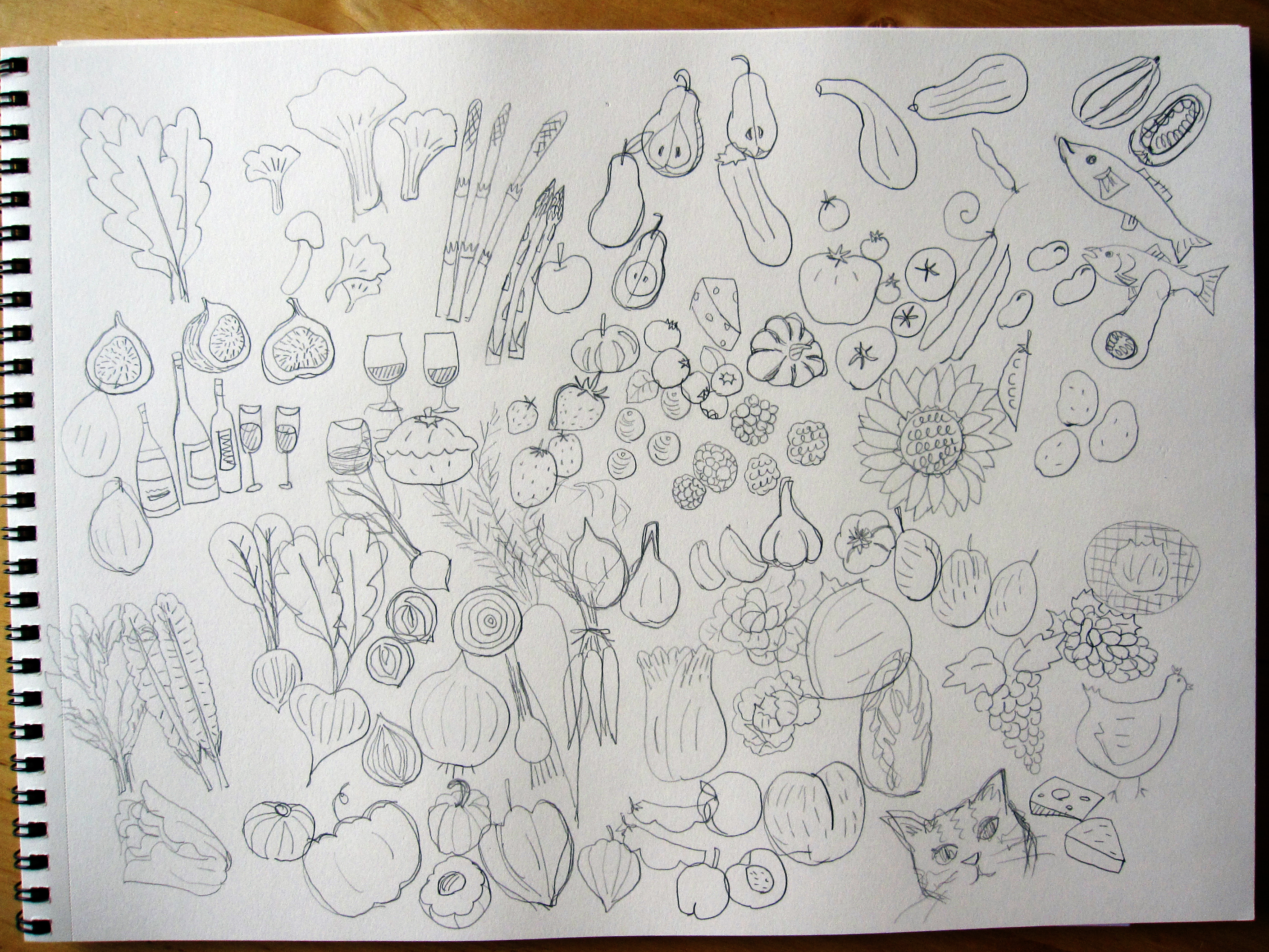
I chose to make 12 black & white illustrations of raw food ingredients for the spot. The assignment also required us to have images of wine bottles & glasses in some of our illustrations.
I usually start my process by making rough sketches with pencil on paper.
まずは鉛筆で色んなイメージをスケッチしていきます。
all kinds of Northwest food ingredients! (and a bonus kitty)
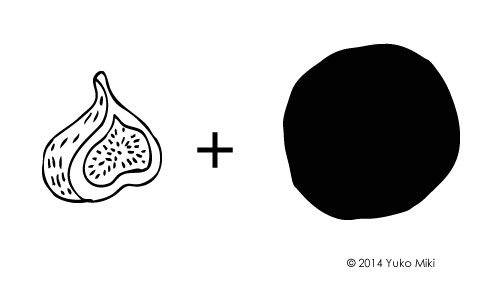
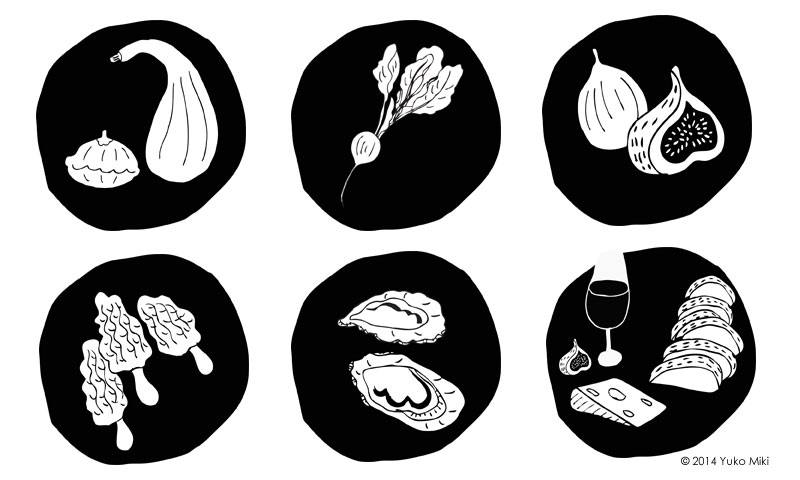
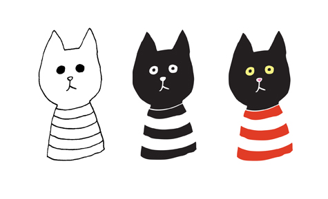
I then made pen & ink drawings to be scanned and processed in Adobe Illustrator. I decided to place each illustration in the black circle to frame item. It gives them consistent look and helps to make the line art stand out.
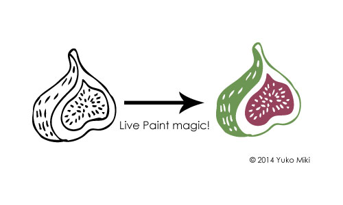
As for the color illustration for the book cover, I decided to use the colored version of the spot illustrations to create a consistency of the look. I also just really liked them 🙂 I used the live paint function in Adobe Illustrator to make colored illustrations for this project.
add beautiful colors to the black & white drawing!
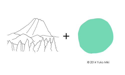
To tie it all together on the cover, I used the same circle shape as the spot illustration in the center. As a way to give a sense of location, I made a line drawing of Mt. Rainier to place in the circle.
When I first heard of the sensory deprivation float a few years ago, I didn’t really get it. You float in the water with no sound, light, or gravity… It sounded kind of dark and scary.
Since then I’ve been trying different meditation and relaxation techniques to manage stress. A couple of months ago, I came across a coupon for Urban Float in Seattle. I decided to have my first float on my birthday! As one of my friends put it, I was going to “spend my birthday in a fake womb.”
I made my appointment for the 50-mins float session. When I checked in, the nice woman there gave me a quick tour of the room & the pod. It was comforting to know that there is an emergency button inside of the pod…
At this facility, you have an option of floating in a pod that looks kind of like a giant, sci-fi kidney bean (pictured below). The water is kept at body temperature, and it is a highly saturated epsom salt and water, so your body floats even though the water is less than knee deep. Once you’re in, you can close the top all the way, or leave it cracked, depending on your comfort level. You wear ear plugs so the water won’t get in your ears. This also helps shut out any noise while you float.
After showering, I wasted no time getting my floatin’ on. I got in the pod, closed the top all the way and lied down in the water. It was a strange feeling to just “float.” Normally, when I’m in the pool or the ocean, I’m trying to swim or move about in the water. But here, you just lie still.
It took me a few minutes to relax my head. I’m so used to laying on something solid, something to support my head, so letting my neck to relax in the water was hard. I was afraid my face is going to be under the water.
I was eventually able to let the water support my head, and my eyes, nose and mouth stayed above water. They play a soothing music for the first and last 5 minutes of your session.
I tried not to move my body once I got the hang of floating. For some reason I was drifting inside of the pod.Eventually, I stopped drifting. But whenever I focused on not moving my legs or arms, it started twitching! Because you don’t have other sensations, I became very sensitive to every little move I made in the water. I felt the water around me rippling with the subtlest of moves.
I thought I read on their website that the light inside of the pod would automatically turn off with the music, so I just floated there for several minutes. I opened my eyes to see if the light had turned off, but it was on… Actually, it stayed on for the entire time. I could’ve turned it off manually, but at that point, I didn’t feel like getting up to push the button, so I let it go. I could also hear sounds from outside as the facility is right by a busy street.
I got out of the pod, showered, and got dressed. I felt super relaxed and a little groggy afterwards. I drank lots of water and cooled off before heading out to the busy outside world!
My very first floating experience didn’t exactly knock my socks off, but it really helped me feel relaxed and detoxed. I would be very curious to see how I would feel if I had an actual “sensory deprivation” experience, you know, without any light or sounds. I’m sure it affects different people differently. If you ever wonder what it’s like, try it and see how you feel!
In my last post, I talked about how I created my brand and named my business Honeyberry Studios. In this post, I want to show you how I designed my logo!
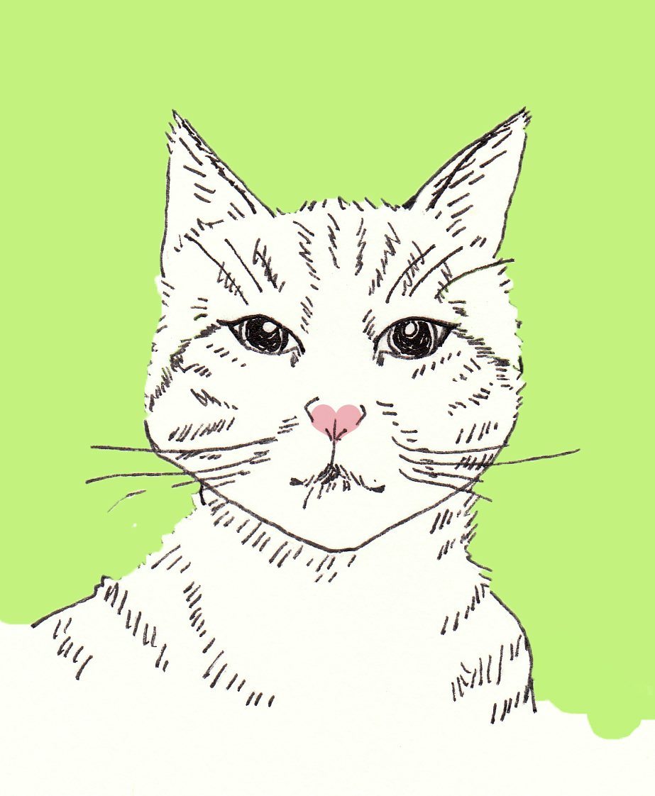
As an illustrator, I thought it would be imperative to create an original image for the logo that showcased my style. People describe my stuff as “cute, warm, friendly,” and such. So my logo needed to have those qualities as well.
It’s kind of silly, but I knew my logo needed to have eyes. I hear that eyes are windows to your soul, and if I wanted it to have some kind of emotional impacts on people, it needed to have eyes!
I also thought to myself: “If this is going to be a logo for my business, I better like looking at it all the time for a long time. What do I like to look at for a loooong time?” The answer was very simple. Cats. I love cats. I used to think of cats 24/7 when I was a child. OK, I still kind of do. I have two kitties, Lulu and Shepherd, and they have modeled for me a few times for my art. I was inspired!
I sketched some cat characters for the logo. It has to be simple enough so it looks good when the size is reduced. It also needs to work in color and in black & white.
Luckily, I was taking a logo design class at that time, so I was able to get helpful feedback from the instructor and my fellow students about my design. This is my first version.
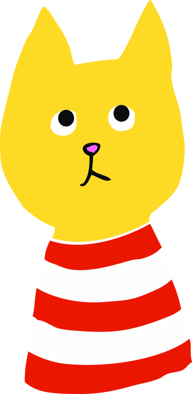
I combined my two lovely kitties, one black cat and one tabby cat with pink nose. After receiving feedback that “black cats have negative connotations,” and “the cat’s stare is too intense,” I made a few changes.
I made the cat honey colored, which actually works perfectly with the company name. Modification with the eyes were made, and it all of a sudden gave the cat some distinctive personality.
For the typeface, I looked for a script typeface that fit. I wanted a typeface that had a soft, handwritten feel to it. After searching for many hours on the inter web, I finally landed on a typeface called “Learning Curve.” I found it beautiful, simple and legible. Done!
I added a circle and dashed line inside of it to have a “stitching” effect to up the handmade feel of my company. For my class project, I incorporated the company name in to the logo, but in practice, I use them side by side. The warp of the text did not look good in the circle, and I would have needed to make the cat so small in order for the text to be big enough.